Graphical exploration of data with GraphDB
Loading data in the GraphDB triplestore
Note
To find out more watch the Schema and Data Visualization Training
The data in RDF can be loaded and sometimes also visualized in triple stores. Here, we demonstrate how to load and visualize data in GraphDB. GraphDB’s documentation gives a good overview of the options to load RDF data into GraphDB.
Step 1: Create and configure a repository
First, you have a create a new repository which will hold the data:
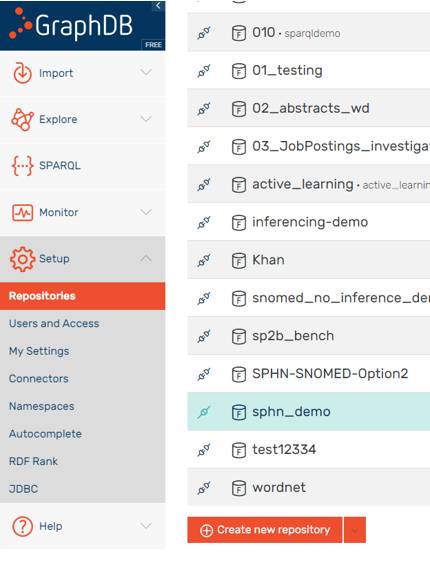
Figure 1: Create a new repository.
Fill in the necessary information:
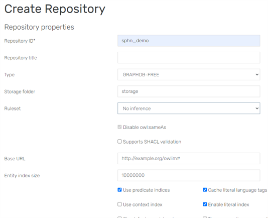
Figure 2: Fill in the necessary information.
Select the repository on the top right before importing data into the created repository:
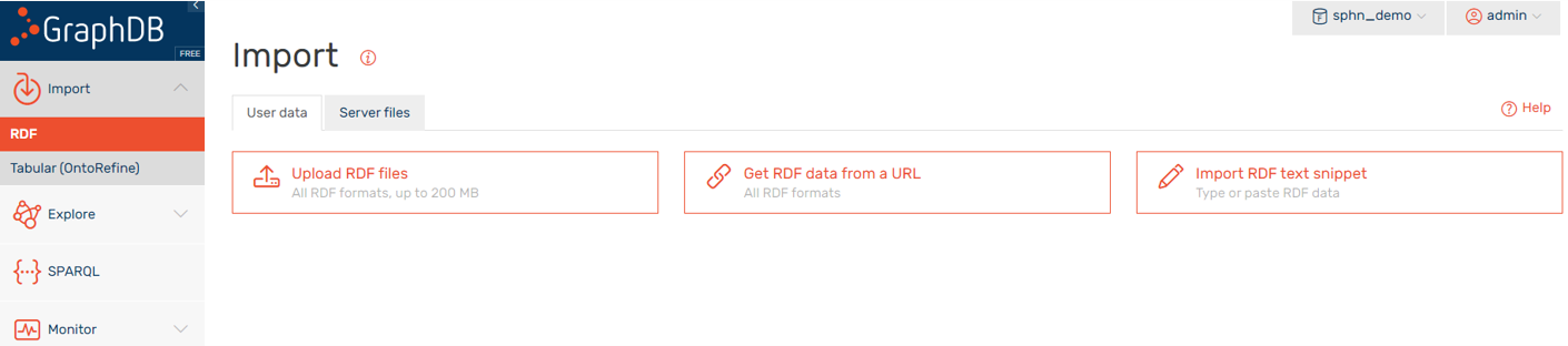
Figure 3: First select the repository on the top right, then import data into the repository.
Enable the Autocomplete setting to ease your searches in the tool:
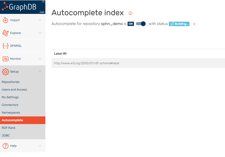
Figure 4: Enabling the Autocomplete setting in this repository easens the search.
The data indexing time will depend on the size of the data. With the autocomplete index you will be able to use the tools and more easily search for the labels (e.g., visual graph or SPARQL editor).
Step 2: Import data
There are several options for loading the data into GraphDB.
Option A: Import from a text snippet
In this example we will import data via a text snippet that is copied into the web front-end. In the Import/RDF menu, on the User data tab, select Import RDF text snippet.
Figure 5: Import RDF text snippet.
Copy and paste the following text into the text field:
@prefix sphn: <https://biomedit.ch/rdf/sphn-ontology/sphn#> .
@prefix snomed: <http://snomed.info/id/> .
@prefix rdf: <http://www.w3.org/1999/02/22-rdf-syntax-ns#> .
@prefix resource: <https://biomedit.ch/rdf/sphn-resource/> .

# types
resource:hospital1-SubjectPseudoIdentifier-anonymous1 rdf:type sphn:SubjectPseudoIdentifier .
resource:hospital1-DataProviderInstitute rdf:type sphn:DataProviderInstitute .

resource:hospital1-Allergy-allergy1 rdf:type sphn:Allergy .
resource:hospital1-Substance-peanuts1 rdf:type sphn:Substance ;
    sphn:hasSubstanceCode resource:Code-SNOMED-CT-762952008 .
resource:Code-SNOMED-CT-762952008 rdf:type snomed:762952008 .

# relations to the allergy
resource:hospital1-Allergy-allergy1 sphn:hasSubjectPseudoIdentifier resource:hospital1-SubjectPseudoIdentifier-anonymous1 .
resource:hospital1-Allergy-allergy1 sphn:hasDataProviderInstitute resource:hospital1-DataProviderInstitute .
resource:hospital1-Allergy-allergy1 sphn:hasSubstance resource:hospital1-Substance-peanuts1 .
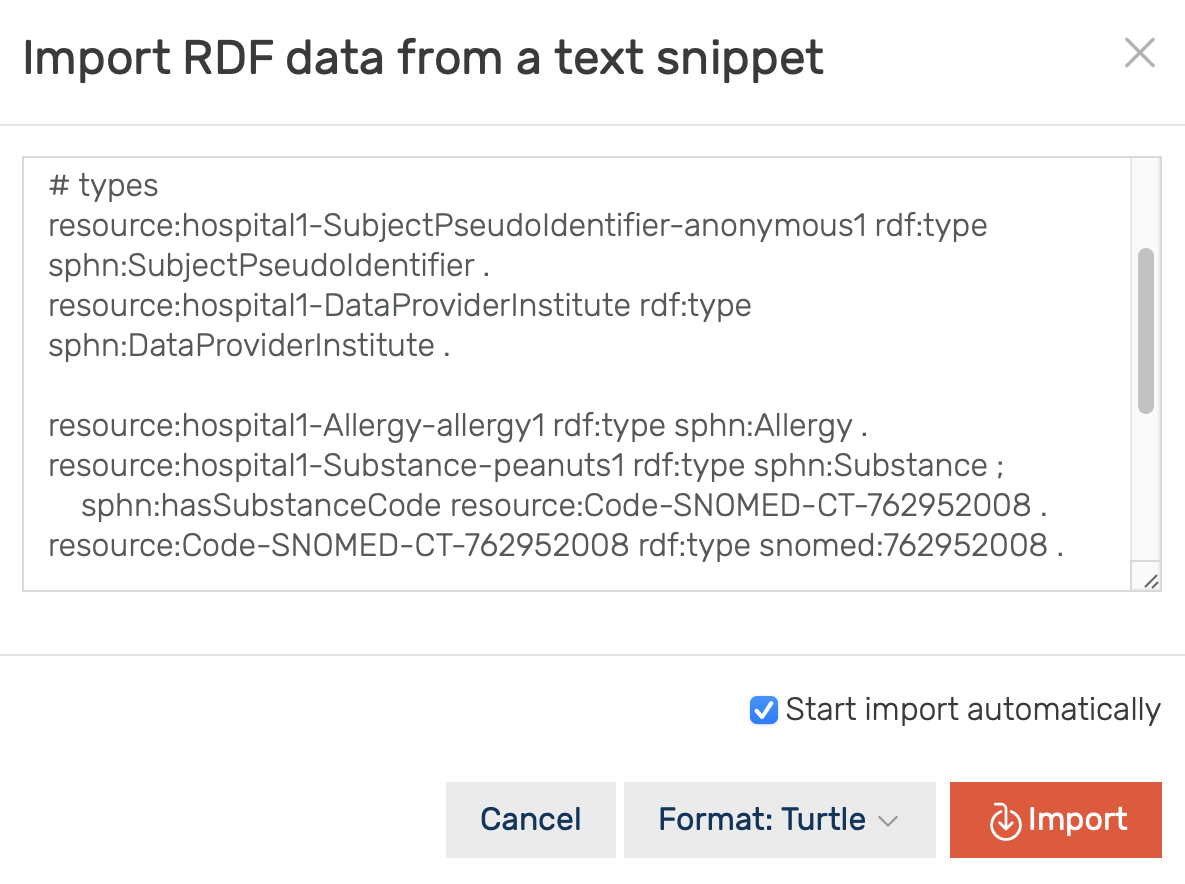
Figure 6: This shows the import from a text snippet.
Accept the default settings:
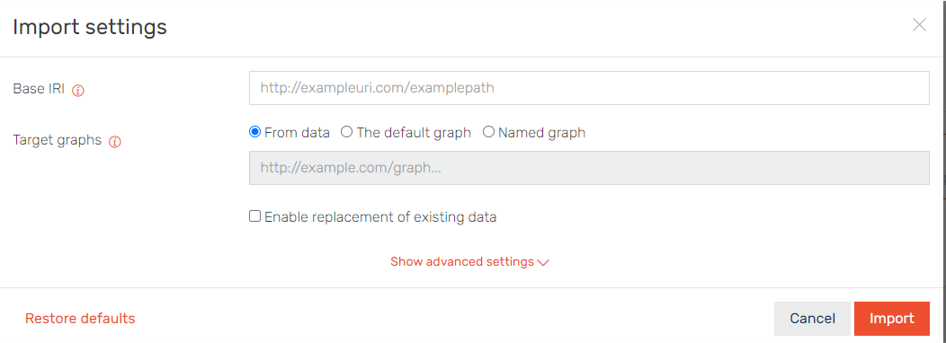
Figure 7: We accept the default settings.
A message appears showing the successful import:
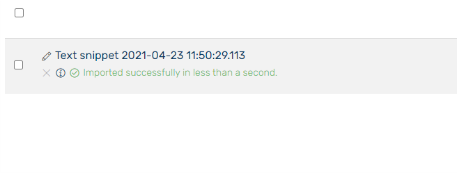
Figure 8: Message showing the successful import.
Option B: Import from server files
If enabled at your GraphDB instance, data in a dedicated folder on the GraphDB server is exposed to the user interface. To list and load these files and folders, navigate to the Import/RDF menu, select the Server files tab, and import the selected or all files.
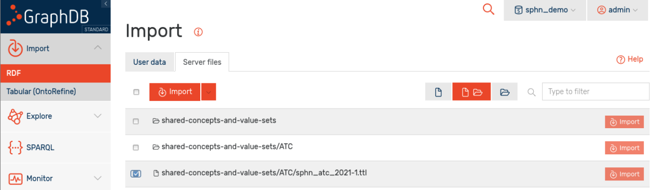
Figure 9: Data import via server files.
When prompted, accept all default settings (as above).
A message appears showing the successful import:
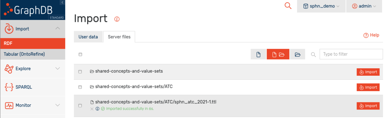
Figure 10: Message showing the successful import.
Option C: Import via the preload command
For large datasets, GraphDB’s preload tool offers a better performance than the import via the user interface.
The preload command needs to be executed directly on the GraphDB server. Please get in touch with your instance’s system administrators.
Monitoring resources while importing data
System resources, such as memory or CPU consumption, can be monitored via Monitor/Resources:
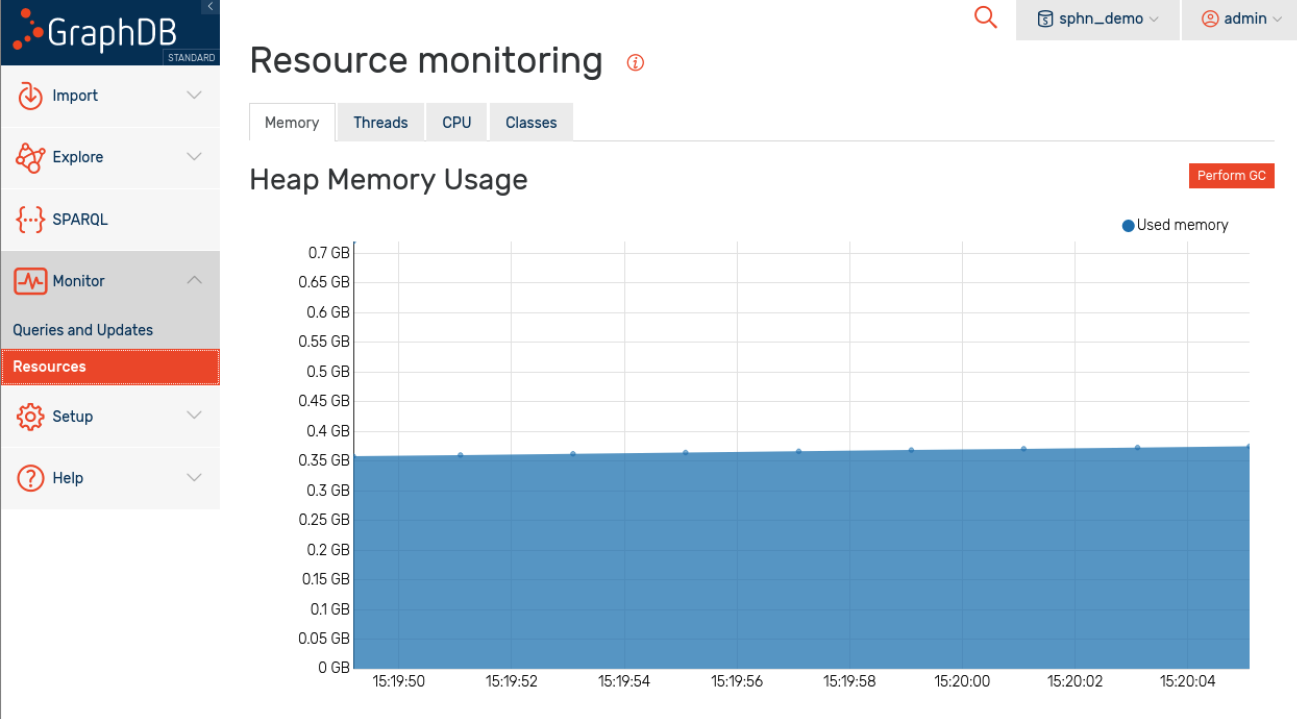
Figure 11: Resource monitoring.
This can be helpful to debug issues with excessive resource consumption, especially when importing large datasets.
Schema and data visualization
The graphs can be managed in the “Graphs overview” section, as shown in Figure 12. Here, in addition to the default graph, there is a named graph for the ontology, and a named graph for the mock-data. Having data in a separate graph allows for more flexibility in its management. For instance, it becomes possible now to only replace the mock-data without having to delete all the content and reload both a mock-data and the ontology.
Note
If multiple datasets are provided in different named graphs, it is also possible to write queries that will only look into one of the dataset instead of the whole content.
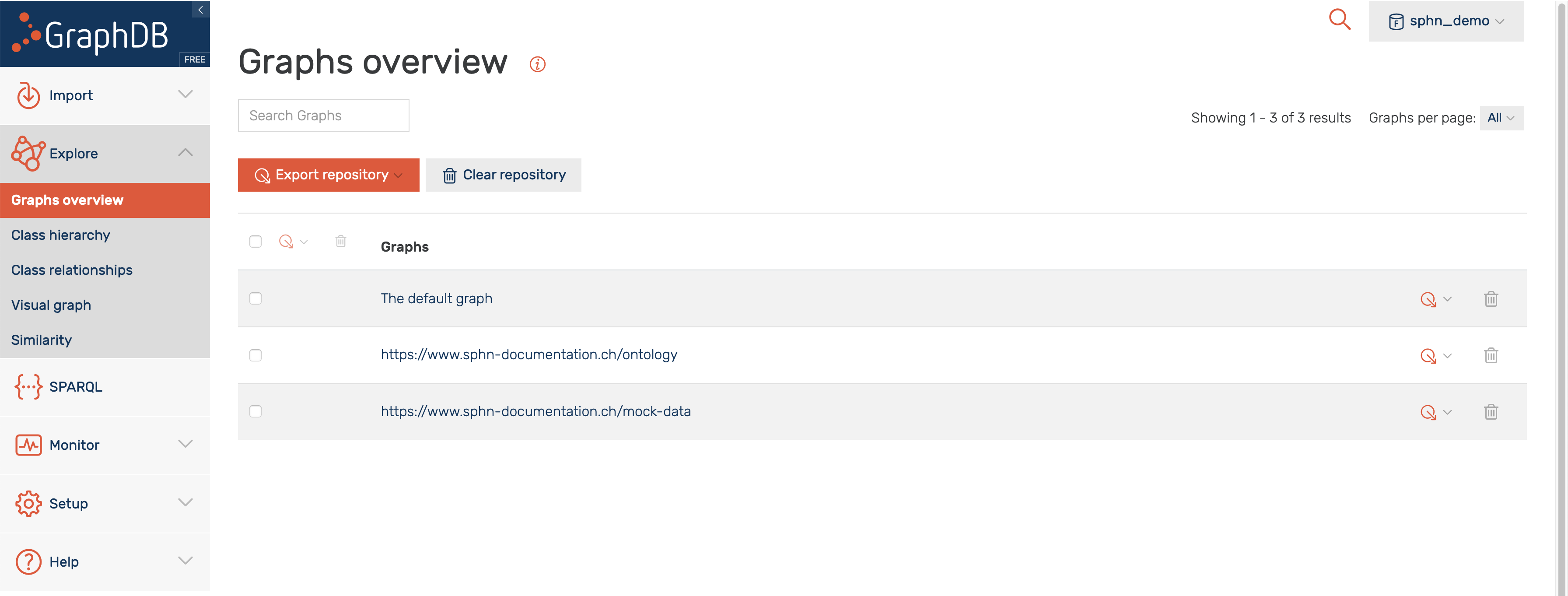
Figure 12: Graphs overview section in GraphDB.
Mock-data
In order to demonstrate the visualization capabilites of GraphDB some mock-data will be used, an overview of which is shown in Figure 13. The mock-data is modeled with the SPHN ontology and centered around patients, denoted by the class SubjectPseudoIdentifier. In this mock-data, each patient have had an AllergyEpisode, triggered by a Substance, and confirmed by a LabResult. Codes from the external terminologies SNOMED CT is used for encoding substances, LOINC for encoding laboratory tests, and UCUM for encoding units of measurement. For the sake of didactic simplicity, it is assumed that each patient is linked to a single AllergyEpisode and to a single LabResult.
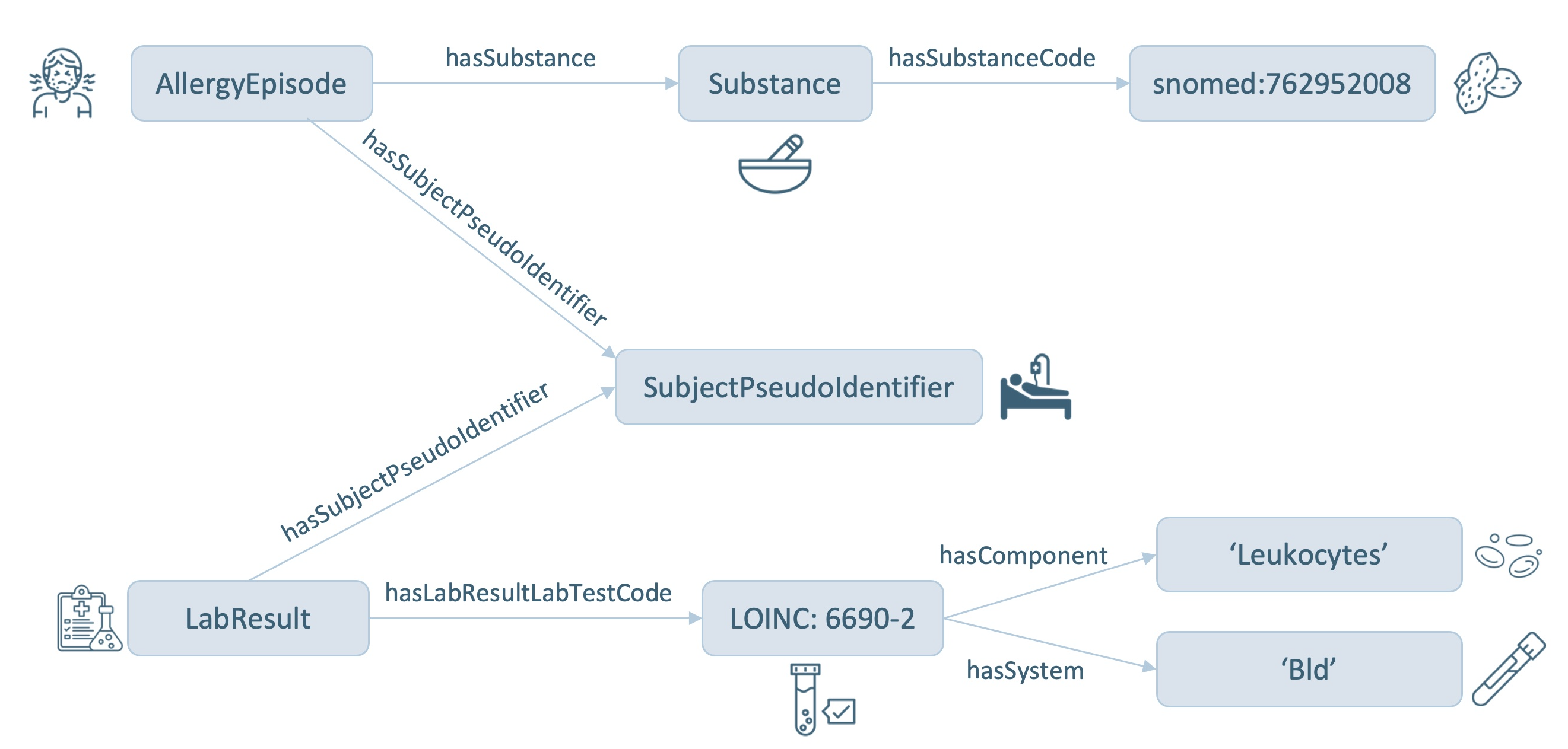
Figure 13: Mock-data overview.
Class hierarchy
Shown in Figure 14 is a class hierarchy visualization in GraphDB, based on the classes from the SPHN RDF schema used in the mock-data. Here, the levels in the hierarchy are represented by packing circles inside other circles. The mock-data used in this example has very little hierarchy - therefore, the classes are visualized as separate circles instead of nested ones. Further information on class hierarchy visualization can be found in GraphDB’s documentation.
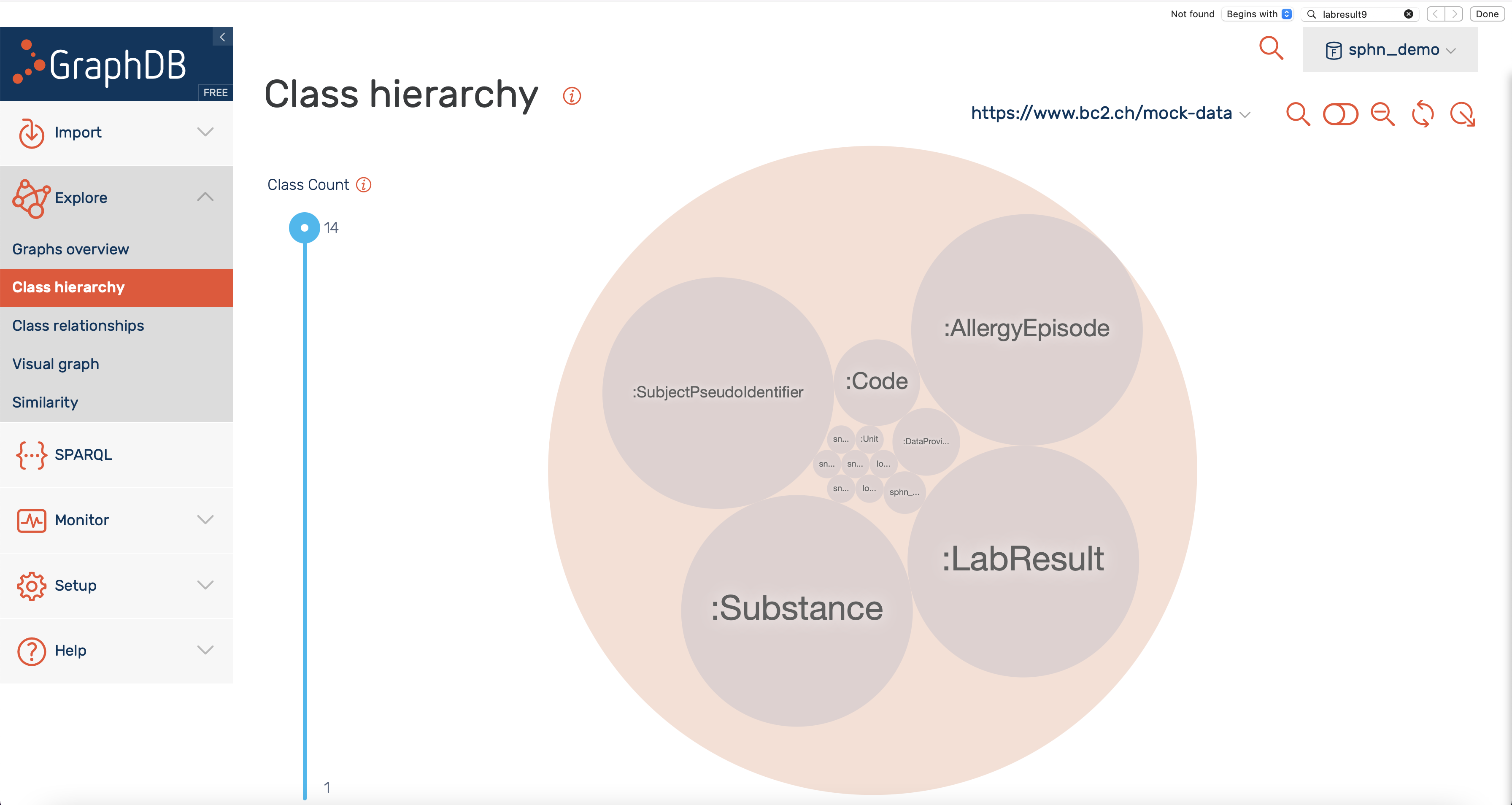
Figure 14: Class hierarchy visualization.
Class relationships
Shown in Figure 15 is a visualization of class hierarchy relationships in GraphDB. Here, the relationship between instances of classes are depicted as bundles of links in both directions. The bundles vary in thickness (indicating the number of links), and in color (indicating the class with the higher number of incoming links). Only the classes with the most ingoing and/or outgoing links are included per default. Classes can be added/removed by clicking on the corresponding icons.
For the mock-data used in this example, we find that the LabResult class is tied for the top spot regarding the total number of links. It is strongly connected to the SubjectPseudoIdentifier, LOINC and Unit class, and has only outgoing links. The SubjectPseudoIdentifier class, on other hand, has both incoming (AllergyEpisode, LabResult) and outgoing (DataProviderInstitute) links. Further information on class relationships visualization can be found in GraphDB’s documentation.
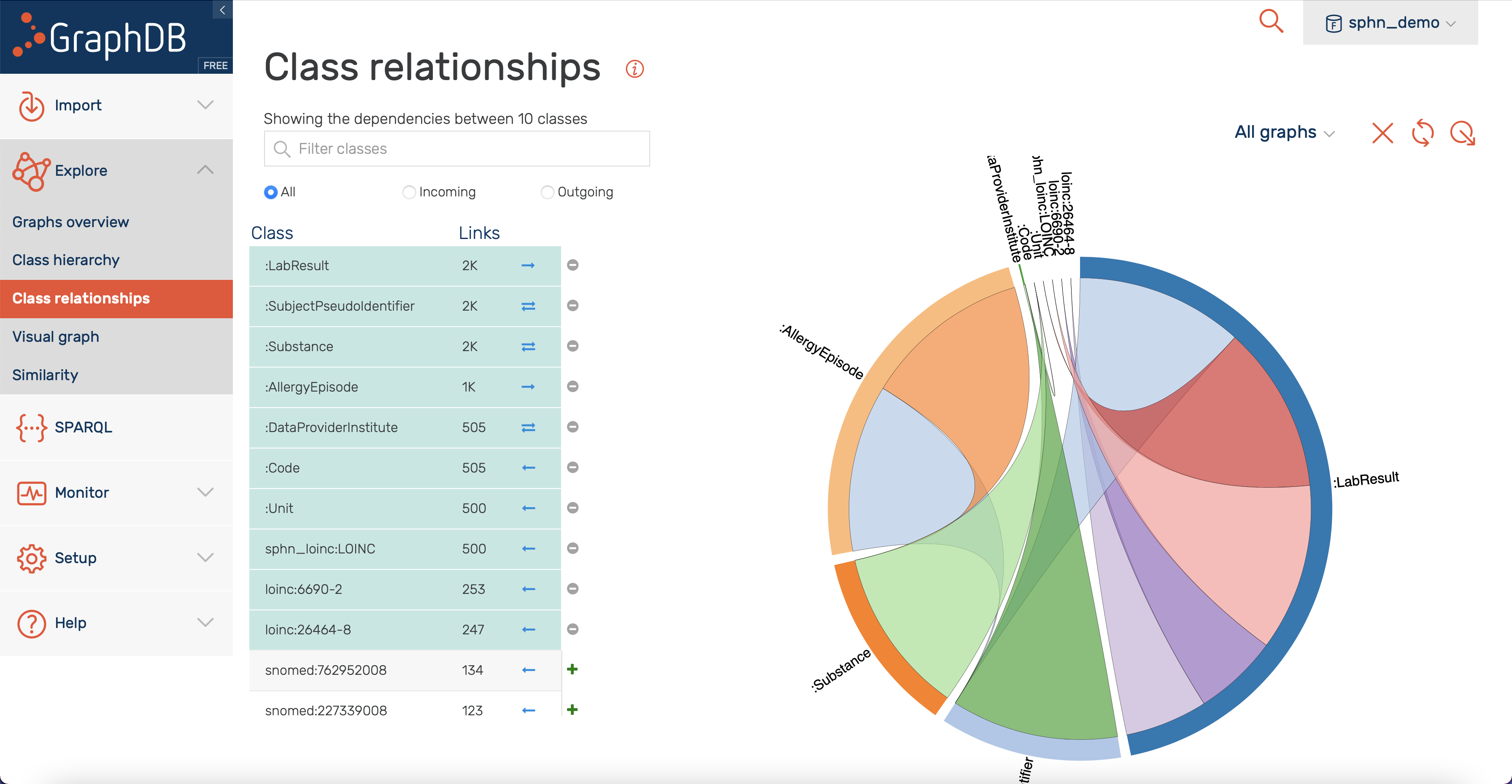
Figure 15: Class relationships visualization.
Visual graph
The GraphDB visual graph functionality enables the visualization of specific class or data of interest that was imported. For example, in Figure 16 the search for LabResult is shown, along with suggestions provided by the Autocomplete functionality (more information).
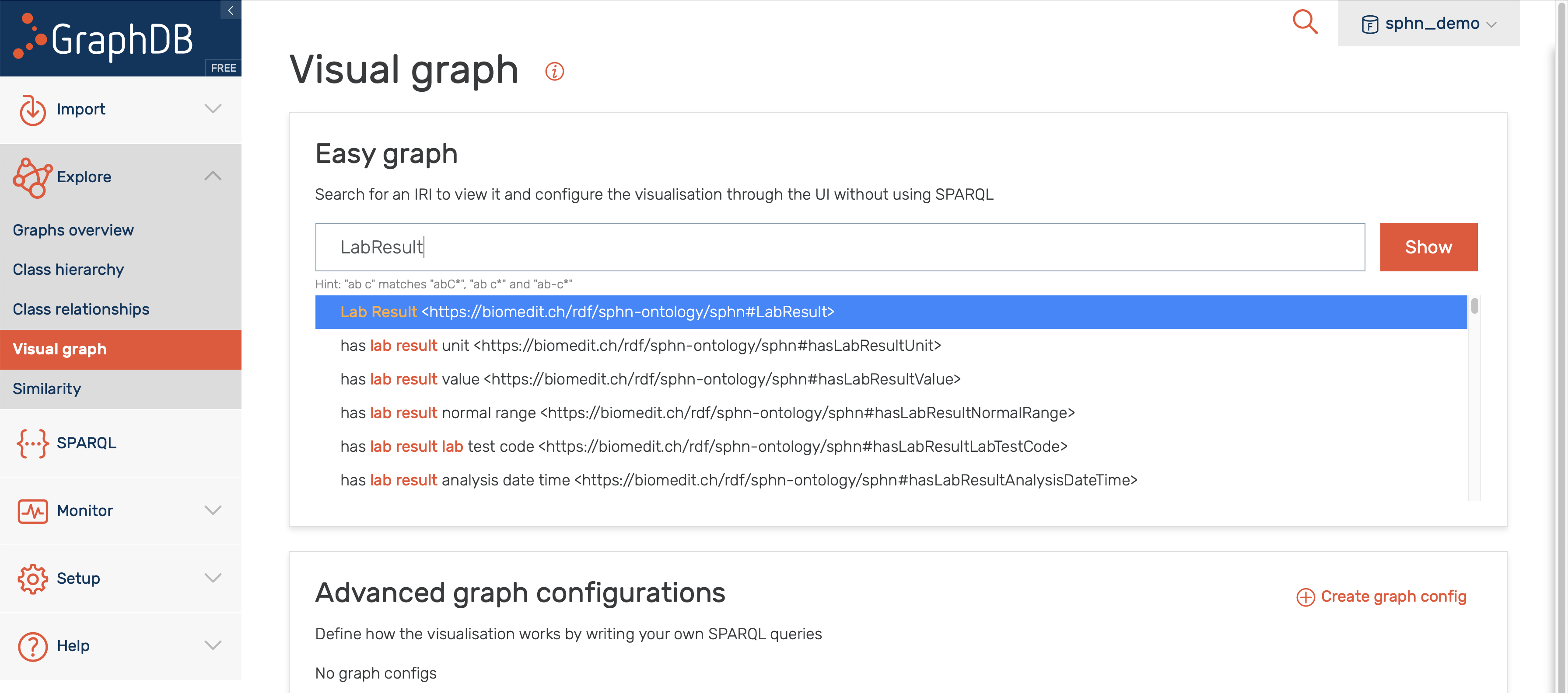
Figure 16: Search for visual graph of the LabResult class.
Following the search for the LabResult, the corresponding class is shown along with its first hop neighbours. Both the imported RDF schema and instances of LabResult (green nodes) are included in the displayed visual graph (see Figure 17).
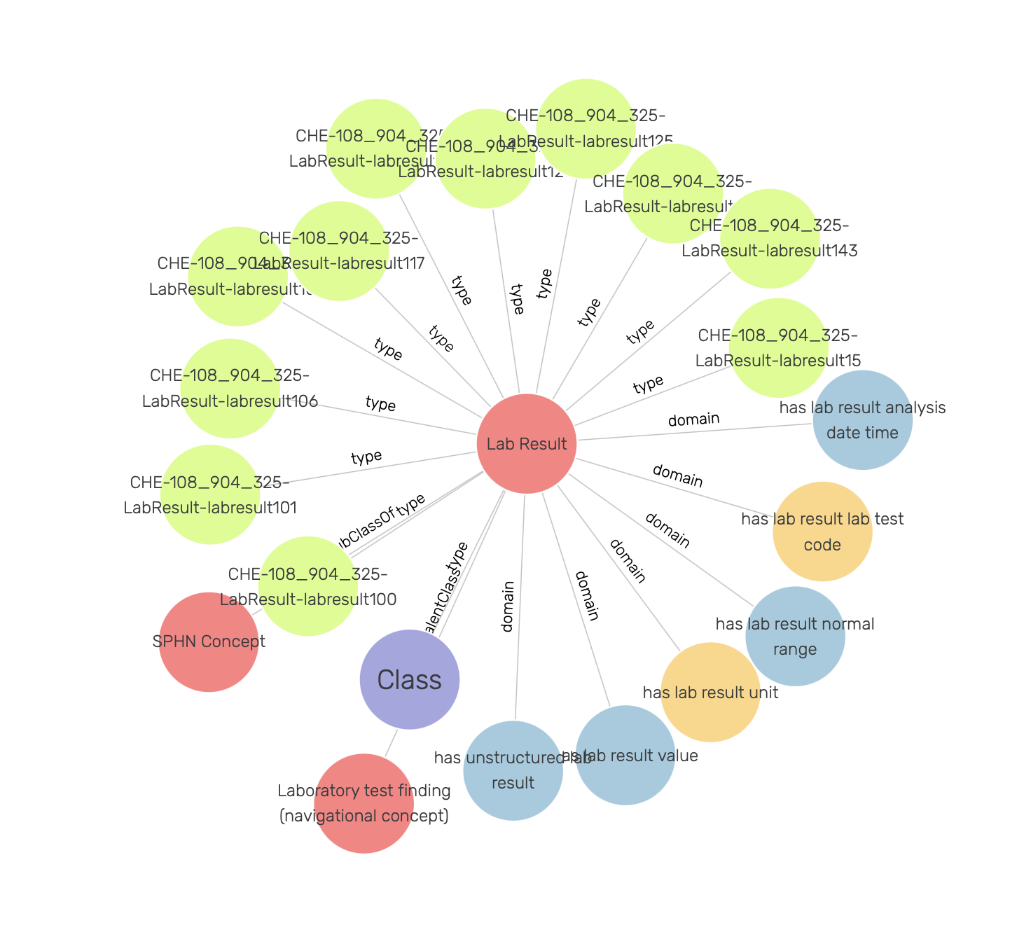
Figure 17: Visual graph for the LabResult class.
Note
Only the first 20 links to other resources are shown per default. This limit, as well as the types and predicates being shown, can be be adjusted in the settings (see Figure 18).
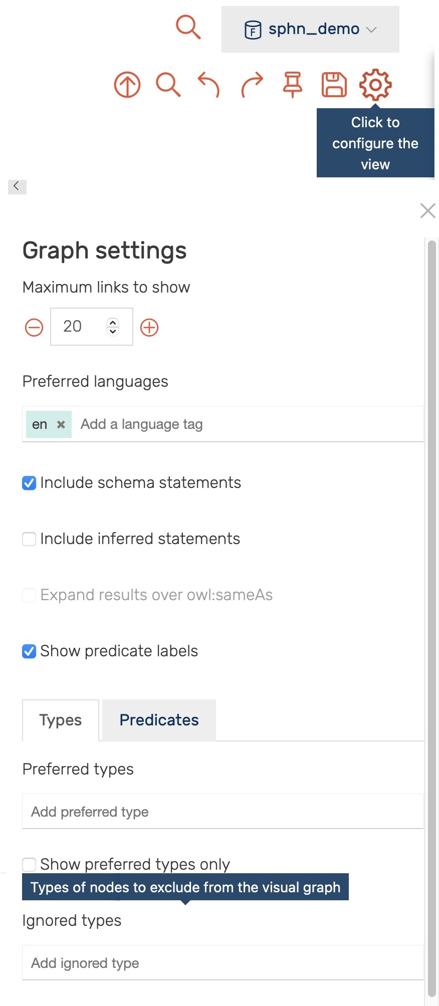
Figure 18: Settings for the visual graph display.
Through the settings one can, for example, exclude all instances of the sphn:LabResult class (i.e., by adding it to the Ignored types) yielding a visual graph of the LabResult schema only (see Figure 19 ). Here, in addition to classes, object properties (yellow) and datatype properties (blue) are shown. The object properties link instances of classes to other instances (e.g., LabResult to Unit by hasLabResultUnit). The datatype properties link instances of classes to literal values (e.g., LabResult to dateTime by hasLabResultAnalysisDateTime).
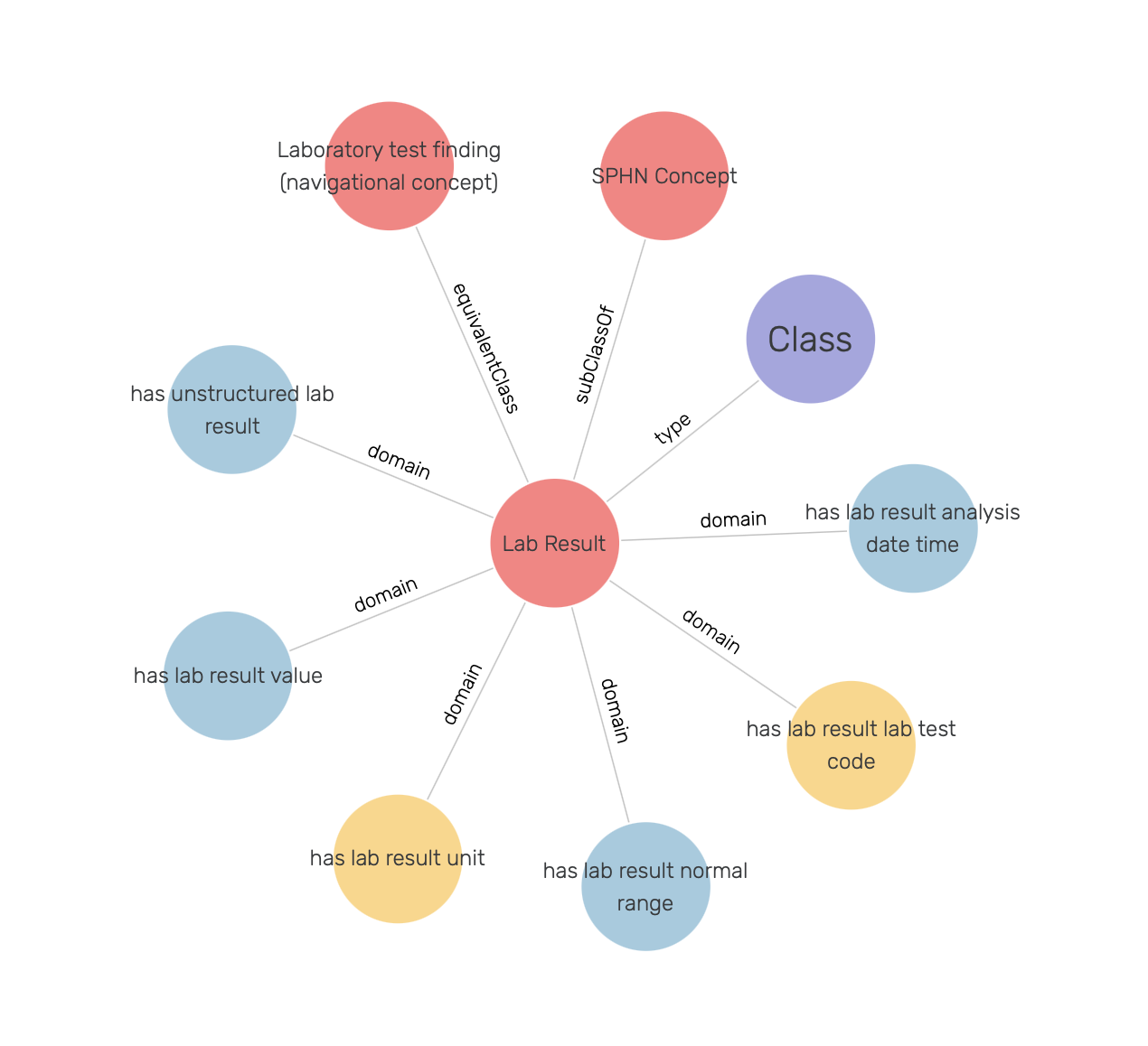
Figure 19: LabResult schema.
One can also search for instances of a class, as shown in Figure 20.
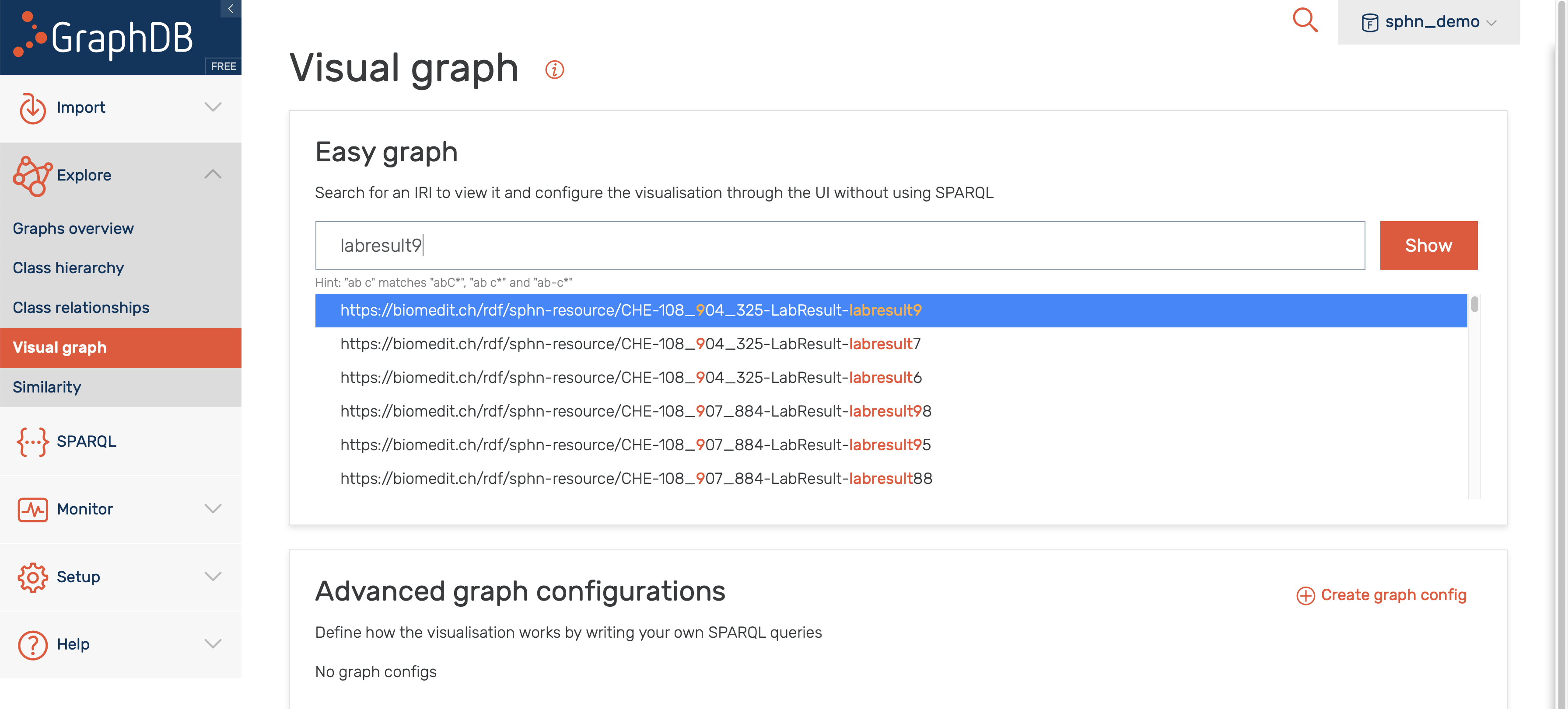
Figure 20: Search for visual graph of an instance of LabResult class.
A closer inspection of the visual graph for an instance of the LabResult class (e.g., CHE-108_904_325-LabResult-labresult9 in Figure 21) reveals object property links to a LOINC code instance, an UCUM code instance, and an instance of the SubjectPseudoIdentifier.
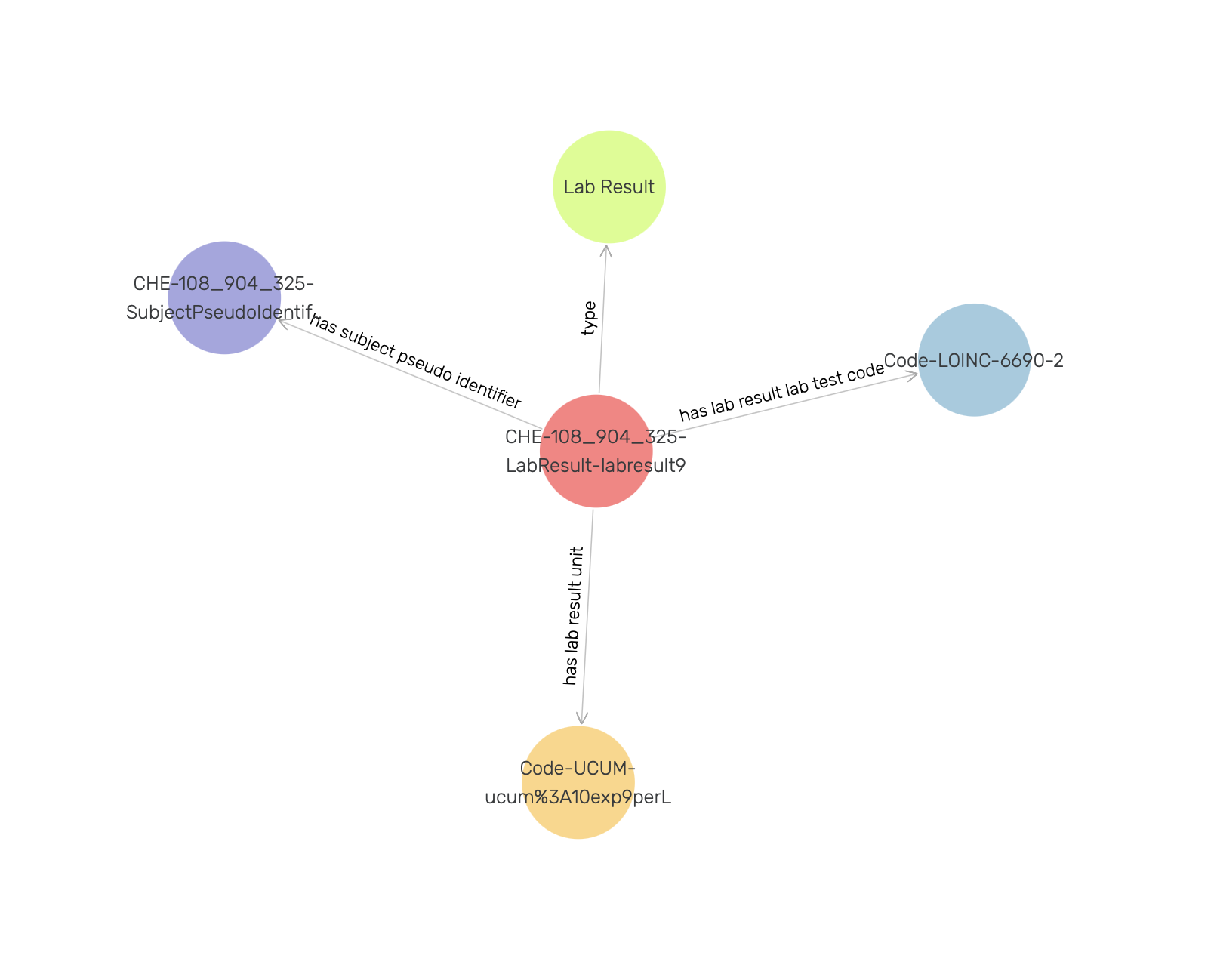
Figure 21: Visual graph for an instance of the LabResult class.
By clicking once on a LabResult instance (e.g., CHE-108_904_325-LabResult-labresult9) a side panel appears, providing additional information as shown in Figure 22.
Note
In addition to annotations (label, description, etc.) side panel also contains datatype properties along with their values.
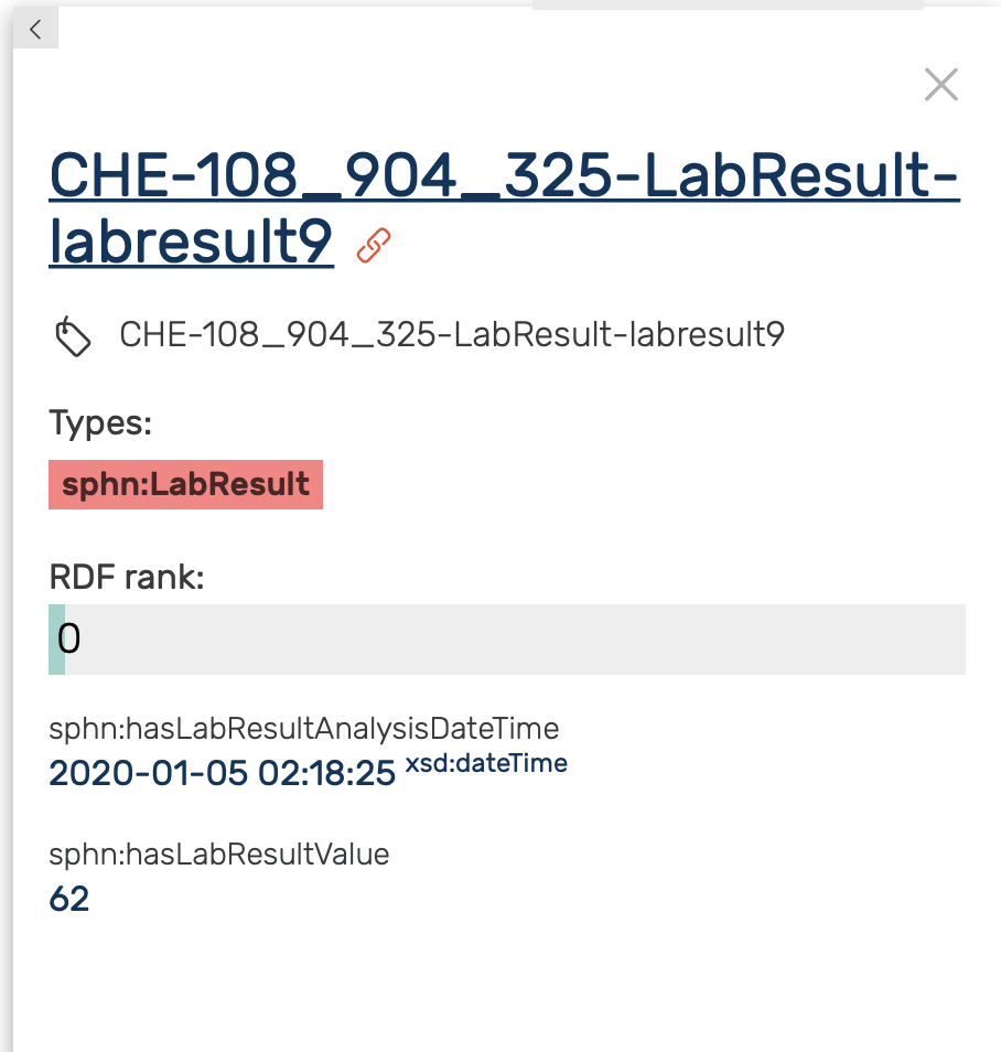
Figure 22: Side panel for an instance of the LabResult class.
Double clicking on a node expands it by showing its first hop neighbours, as demonstrated in Figure 23 for the Code-LOINC-6690-2 instance. Note that a single code instance is shared among different LabResult instances (not visible in Figure 23 due to settings). One can learn more about the LOINC code either by inspecting the side panel, or by visiting the URI of the LOINC code.
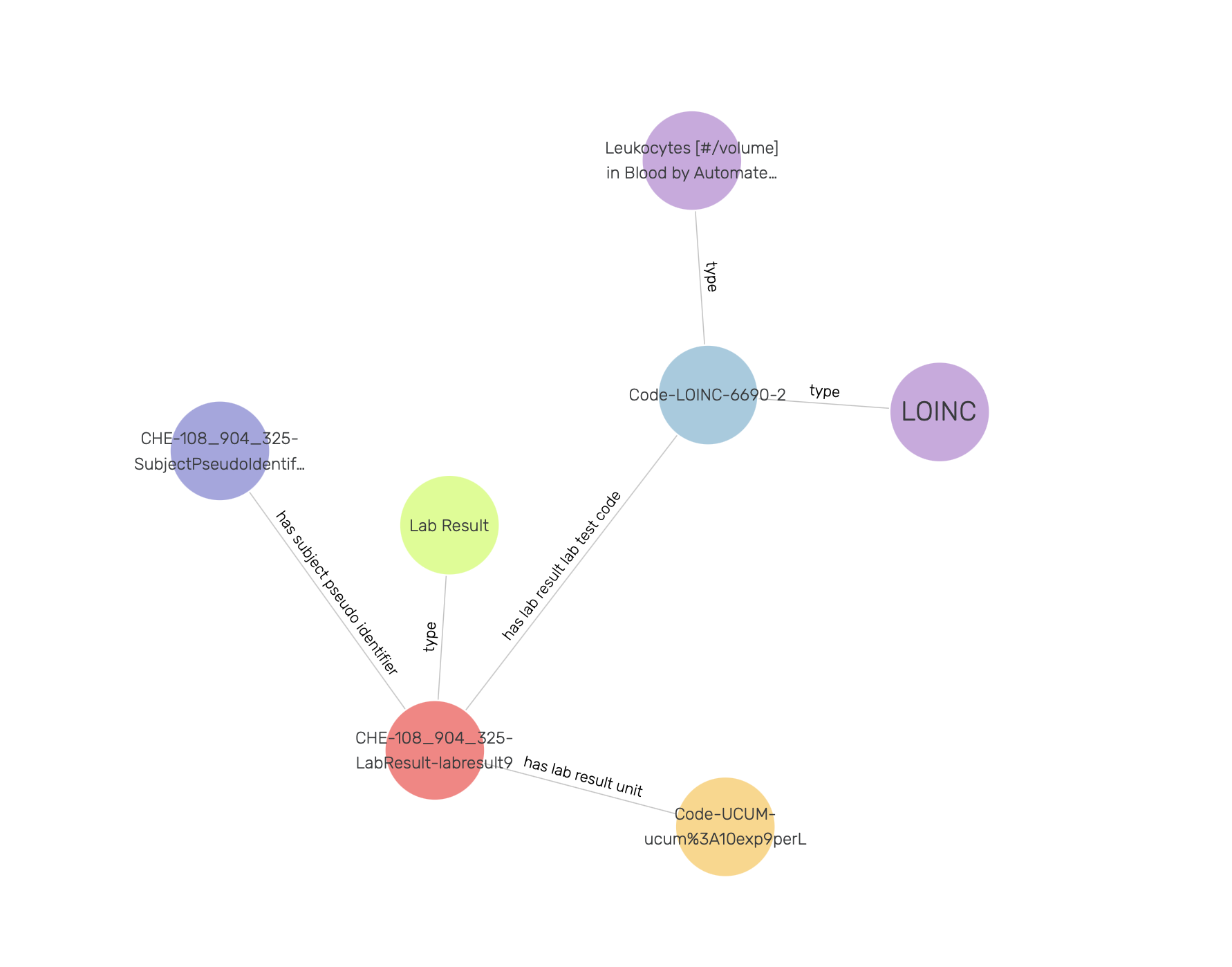
Figure 23: Exploring a LOINC code instance in a visual graph.
Similarly, one can explore the linked UCUM code instance, and learn that it has 10exp9perL as unit code (see Figure 24 ).
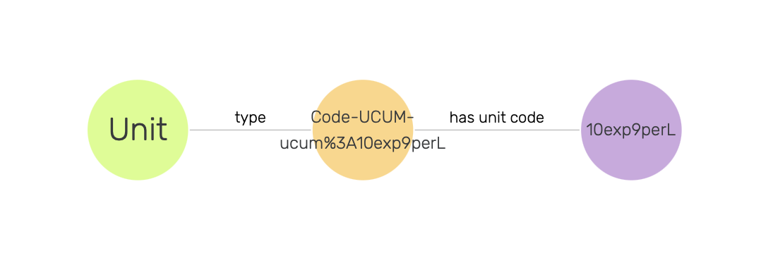
Figure 24: Exploring an UCUM code instance in a visual graph.
Now in order to find out more about what is causing the allergy, we need to traverse the visual graph by visiting SubjectPseudoIdentifier, AllergyEpisode, and Substance instances (see Figure 25). Here, we find that the Substance instance is linked to a SNOMED CT code instance, and in Figure 26 we observe that this code is of type Peanut.
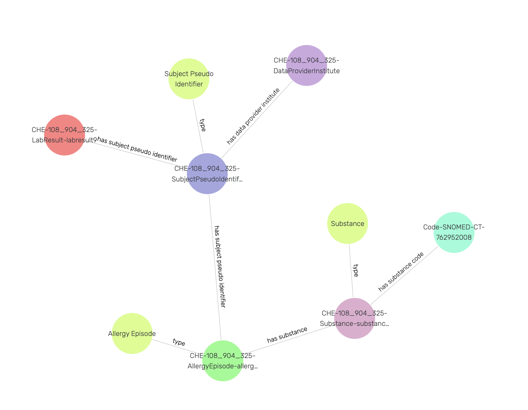
Figure 25: Exploring a SNOMED CT code instance in a visual graph.
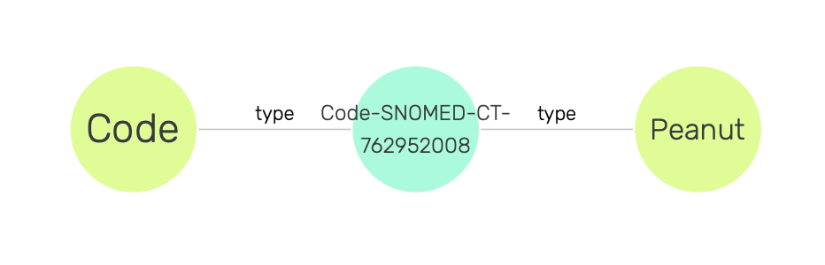
Figure 26: SNOMED CT code of Peanut type.
Once again, we can learn more by visiting the URI of the SNOMED CT code.
Querying and aggregating data for visualization
Similarly to querying relational databases using SQL language, one can also query RDF graph databases using SPARQL language. The queried data can then be aggregated for visualization, e.g., with the built in Google Chart functionality in GraphDB. An example of this process is shown in Figure 27, where the mock-data is queried for instances of classes. The retrieved instances are then aggregated per class, and the aggregated counts are visualized using Google Chart.
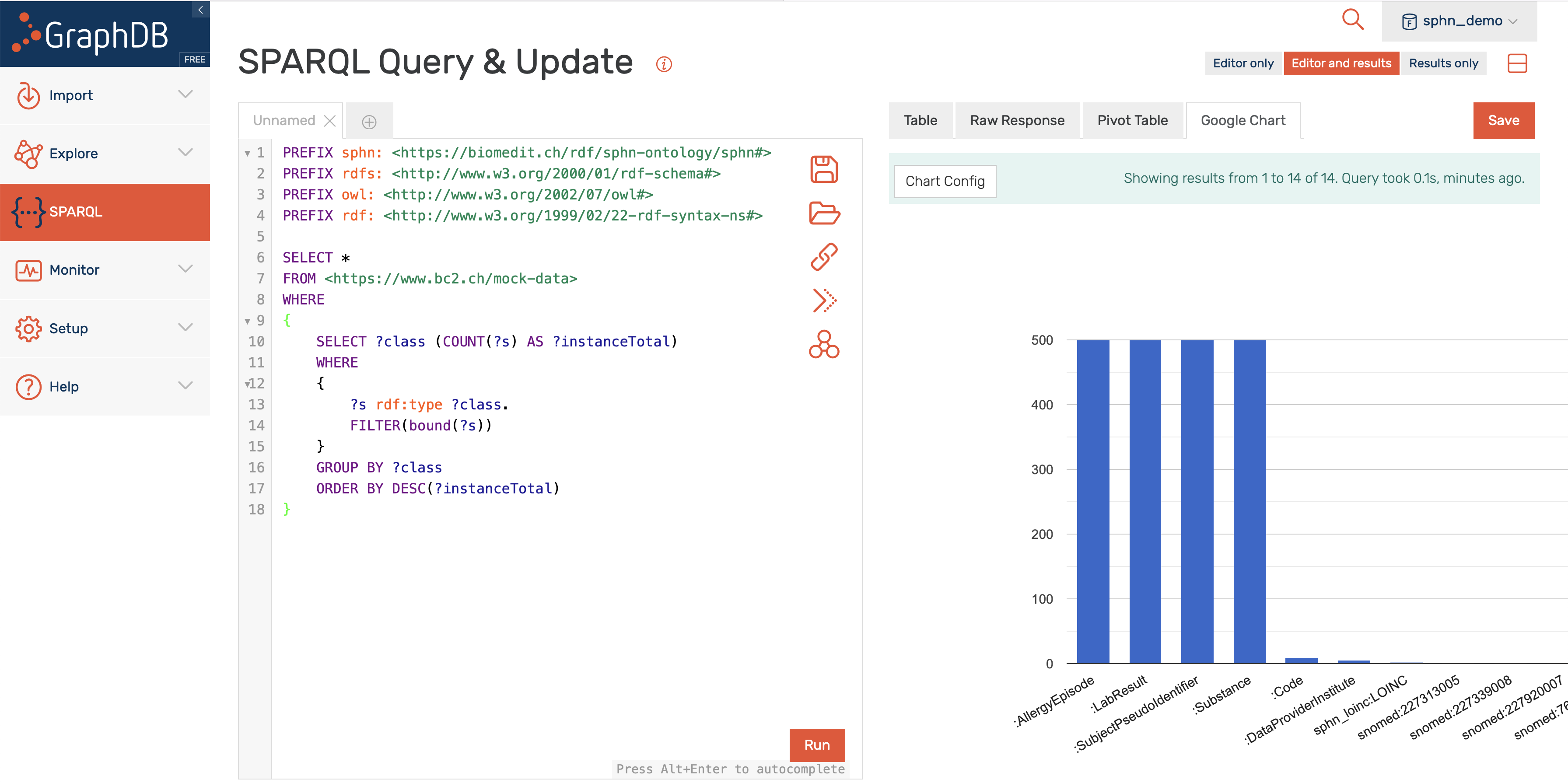
Figure 27: Example of querying and aggregating data for visualization using SPARQL and Google Chart.
The SPHN RDF schema is available in git (the visual documentation is accessible here). For training and testing purposes, the mock data and minified (i.e., reduced subset of codes) versions of SNOMED CT and LOINC external terminologies are available upon request (please e-mail the DCC).
For research projects, external terminologies are available through the Terminology Service accessible on the BioMedIT Portal (for additional information, please read about the Terminology Service).