Visually explore data with GraphDB
Note
To find out more watch the Schema and Data Visualization Training
Target Audience
This document is mainly intended for researchers who are interested in exploring with visuals their data using the GraphDB triplestore. This document provides information about data loading and visualization of both the schema and the data in GraphDB.
Schema and data visualization
Mock-data
In order to demonstrate the visualization capabilites of GraphDB some mock-data will be used,
an overview of which is shown in Figure 13. The mock-data is modeled with the SPHN RDF Schema
and centered around patients, denoted by the class SubjectPseudoIdentifier.
In this mock-data, each patient has an AllergyEpisode, triggered by an Allergen,
and confirmed by a LabTestEvent.
Codes from the external terminologies SNOMED CT
are used for encoding substances, LOINC
for encoding laboratory tests, and UCUM
for encoding units of measurement.
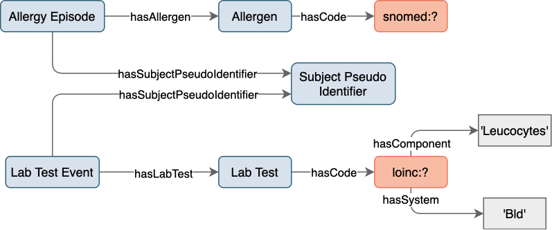
Figure 13: Mock-data overview.
Class hierarchy
Shown in Figure 14 is a class hierarchy visualization in GraphDB, with a focus on the classes from the SPHN RDF Schema used in the mock-data. Here, the levels in the hierarchy are represented by packing circles inside other circles (nested structure). Further information on class hierarchy visualization can be found in GraphDB’s documentation.
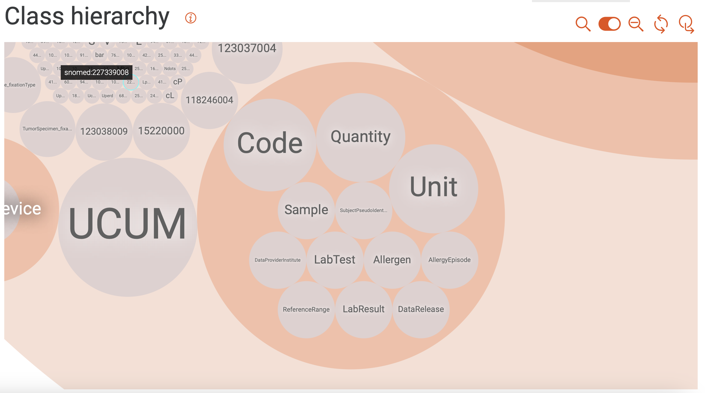
Figure 14: Class hierarchy visualization.
Class relationships
Shown in Figure 15 is a visualization of class hierarchy relationships in GraphDB. Here, the relationship between instances of classes are depicted as bundles of links in both directions. The bundles vary in thickness (indicating the number of links), and in color (indicating the class with the higher number of incoming links). Only the classes with the most ingoing and/or outgoing links are included per default. Classes can be added/removed by clicking on the corresponding icons.
For the mock-data used in this example, we find that the Quantity class is
tied for the top spot regarding the total number of links.
It is strongly connected to the Unit class,
and has both incoming and outgoing links.
The AllergyEpisode class, on the other hand, only has outgoing links and
connects to the DataProvider, BodySite, etc.
Further information on class relationships visualization can be found in GraphDB’s documentation.
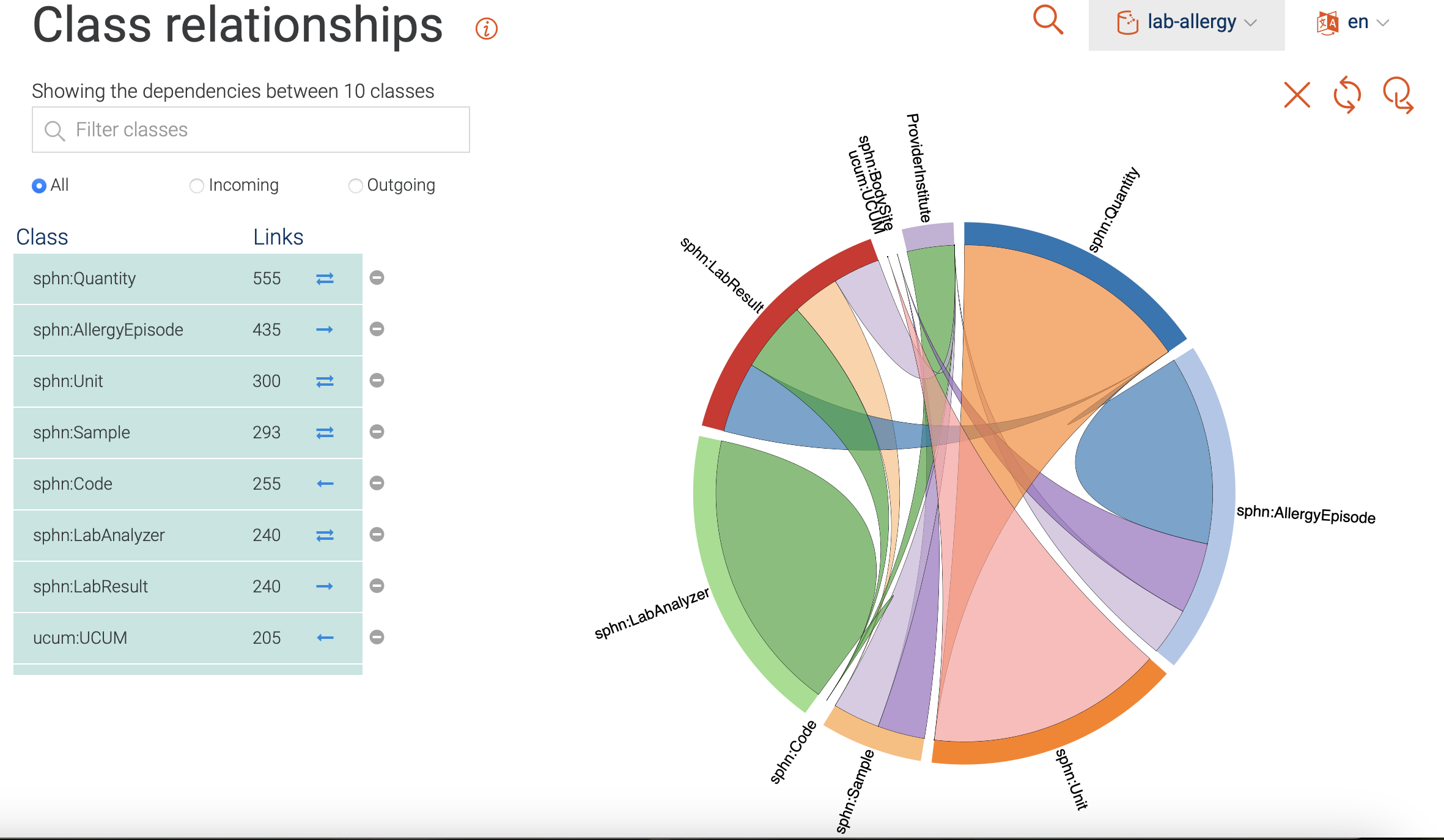
Figure 15: Class relationships visualization.
Visual graph
The GraphDB visual graph functionality enables the visualization of a specific class
or data of interest that was imported. For example, in Figure 16 the search for
LabResult is shown, along with suggestions provided by the Autocomplete functionality.
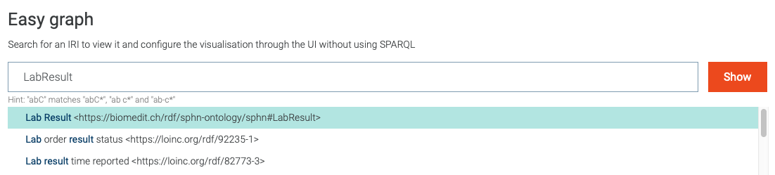
Figure 16: Search for visual graph of the LabResult class.
Following the search for the LabResult,
the corresponding class is shown along with its first hop neighbours.
Both the imported RDF Schema and instances of LabResult (purple nodes)
are included in the displayed visual graph (see Figure 17).
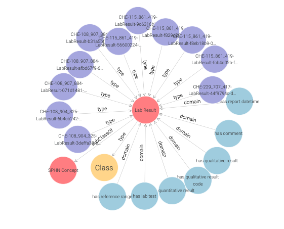
Figure 17: Visual graph for the LabResult class.
Note
Only the first 20 links to other resources are shown per default. This limit, as well as the types and predicates being shown, can be be adjusted in the settings (see Figure 18).
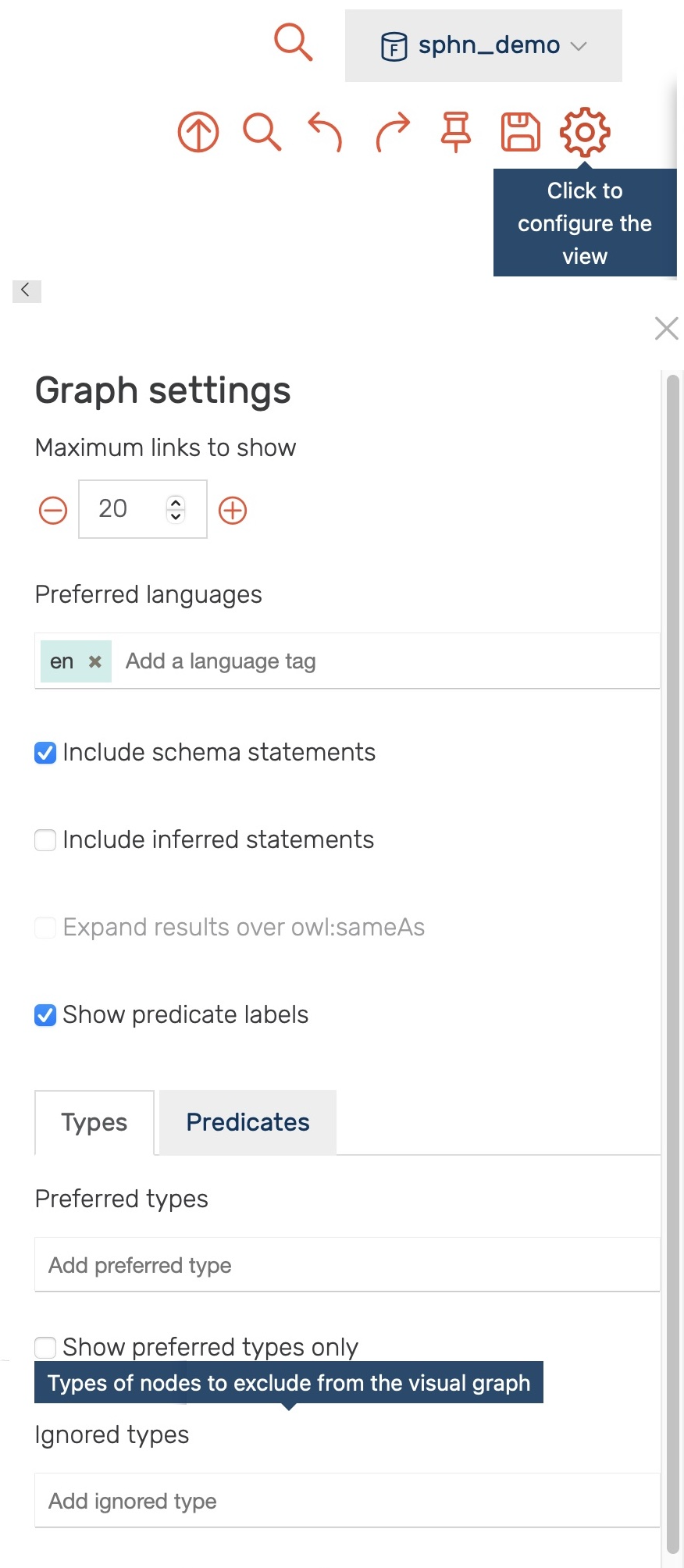
Figure 18: Settings for the visual graph display.
Through the settings one can, for example, exclude all instances of
the sphn:LabResult class (i.e., by adding it to the Ignored types - type sphn:LabResult, press enter)
yielding a visual graph of the LabResult schema only (see Figure 19 ).
Here, in addition to classes, object and datatype properties (blue) are shown.
The object properties link instances of classes to other instances
(e.g., LabResult to Quantity by hasQuantitativeResult).
The datatype properties link instances of classes to literal values
(e.g., LabResult to dateTime by hasReportDateTime).
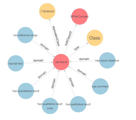
Figure 19: LabResult schema.
One can also search for instances of a class, as shown in Figure 20.
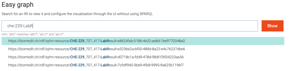
Figure 20: Search for visual graph of an instance of LabResult class.
A closer inspection of the visual graph for an instance of the
LabResult class (e.g., CHE-229_707_417-LabResult-e8624fab-5186-4e32-ae8d-7ee9770348a0 in Figure 21)
reveals object property links to many instances such as a LabTest, ReferenceRange, Sample etc.
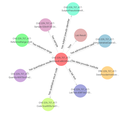
Figure 21: Visual graph for an instance of the LabResult class.
By clicking once on a LabResult instance (e.g., CHE-229_707_417-LabResult-e8624fab-5186-4e32-ae8d-7ee9770348a0)
a side panel appears, providing additional information as shown in Figure 22.
Note
In addition to annotations (label, description, etc.) side panel also contains datatype properties along with their values.

Figure 22: Side panel for an instance of the LabResult class.
Double clicking on a node expands it by showing its first hop neighbours,
as demonstrated in Figure 23 for the Code-LOINC-804-5 instance.
Note that a single code instance is shared among different LabResult instances.
One can learn more about the LOINC code either by inspecting the side panel,
or by visiting the URI of the LOINC code.
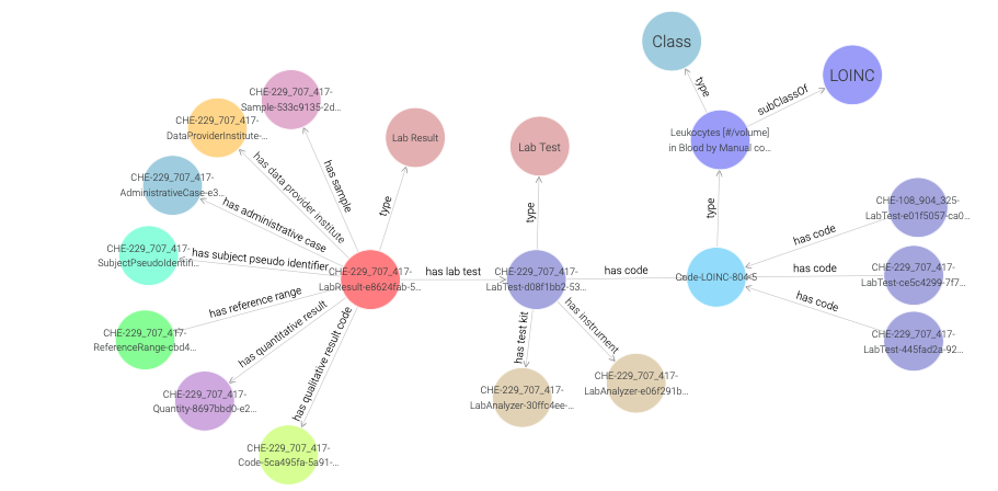
Figure 23: Exploring a LOINC code instance in a visual graph.
One can also explore the UCUM code instance which is connected to the Quantity class,
and learn that it has cal as unit code (see Figure 24 ).
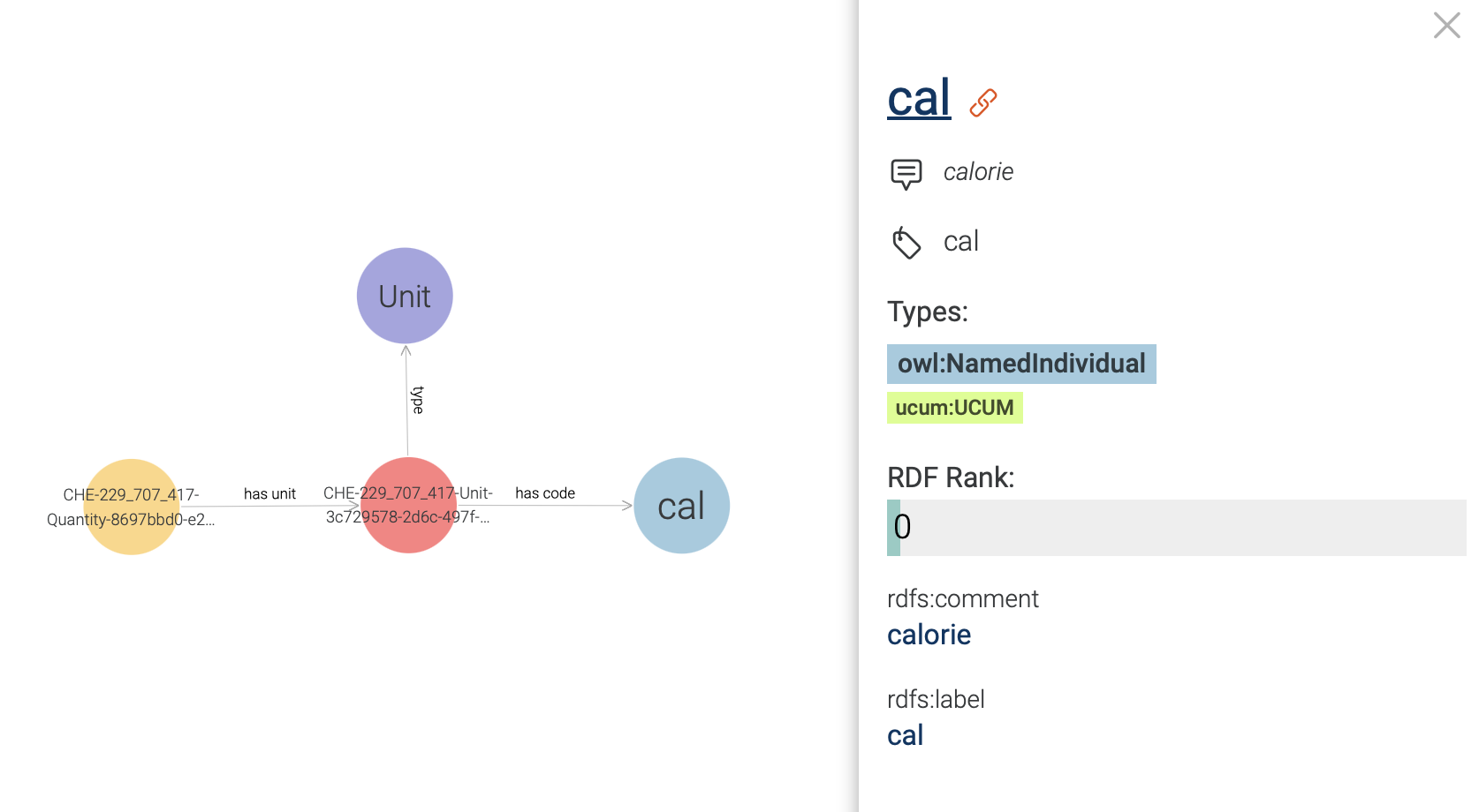
Figure 24: Exploring an UCUM code instance in a visual graph.
Now in order to find out more about what is causing the allergy,
we need to traverse the visual graph by visiting SubjectPseudoIdentifier,
AllergyEpisode, and Allergen instances (see Figure 25).
Here, we find that the Allergen instance is linked to a SNOMED CT code instance,
and in Figure 26 we observe that this code is of type Egg white.
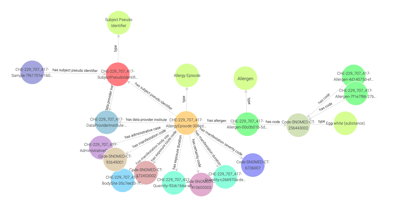
Figure 25: Exploring a SNOMED CT code instance in a visual graph.
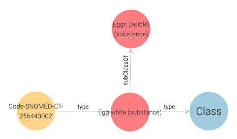
Figure 26: SNOMED CT code of Egg White.
Once again, we can learn more by visiting the URI of the SNOMED CT code.
Querying and aggregating data for visualization
Similarly to querying relational databases using SQL, one can also query RDF graph databases using SPARQL. The queried data can then be aggregated for visualization, e.g., with the built-in Google Chart functionality in GraphDB. An example of this process is shown in Figure 27, where the mock-data is queried for instances of classes. The retrieved instances are then aggregated per class, and the aggregated counts are visualized using Google Chart.
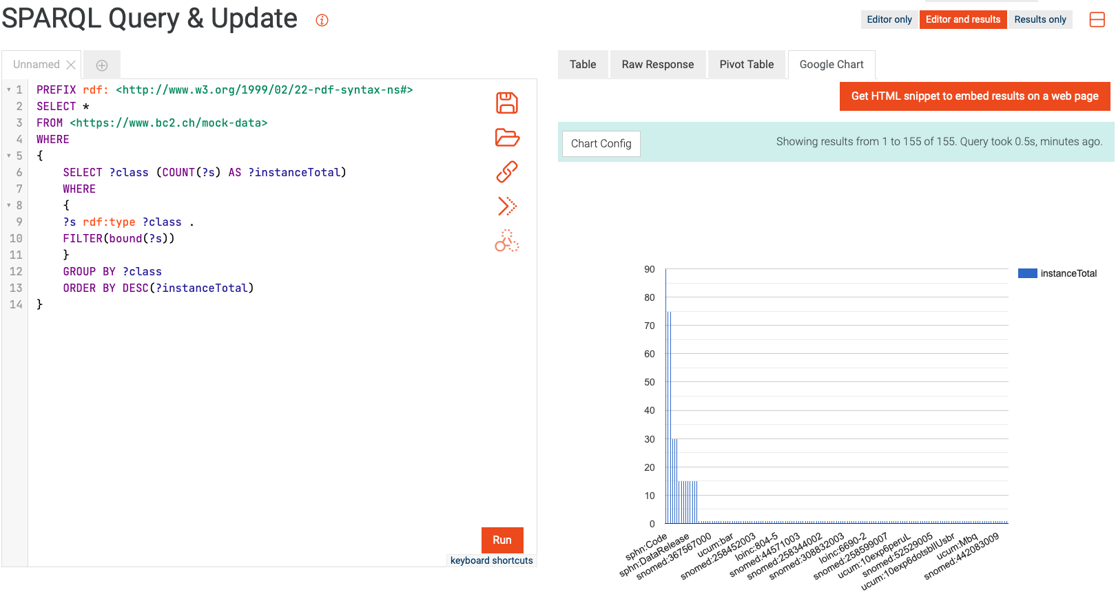
Figure 27: Example of querying and aggregating data for visualization using SPARQL and Google Chart.
Availability
The SPHN RDF Schema is available in git (the visual documentation is accessible here).
The mock data is available in GitLab.
External terminologies are available through the Terminology Service accessible on the BioMedIT Portal (for additional information, please read about the Terminology Service).